> ## Documentation Index
> Fetch the complete documentation index at: https://docs.upsolve.ai/llms.txt
> Use this file to discover all available pages before exploring further.
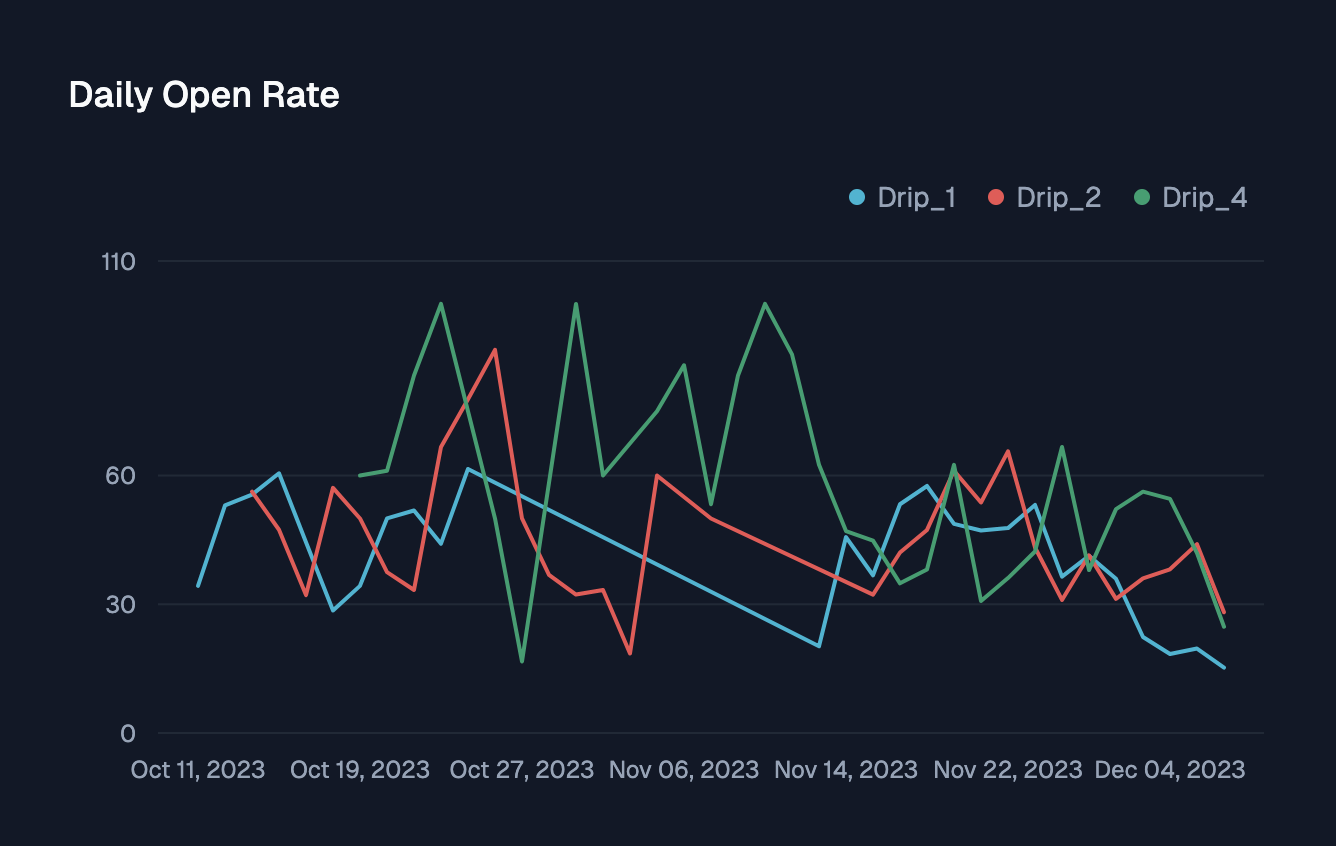
# Line Chart
> Displays quantitative data with connected data points
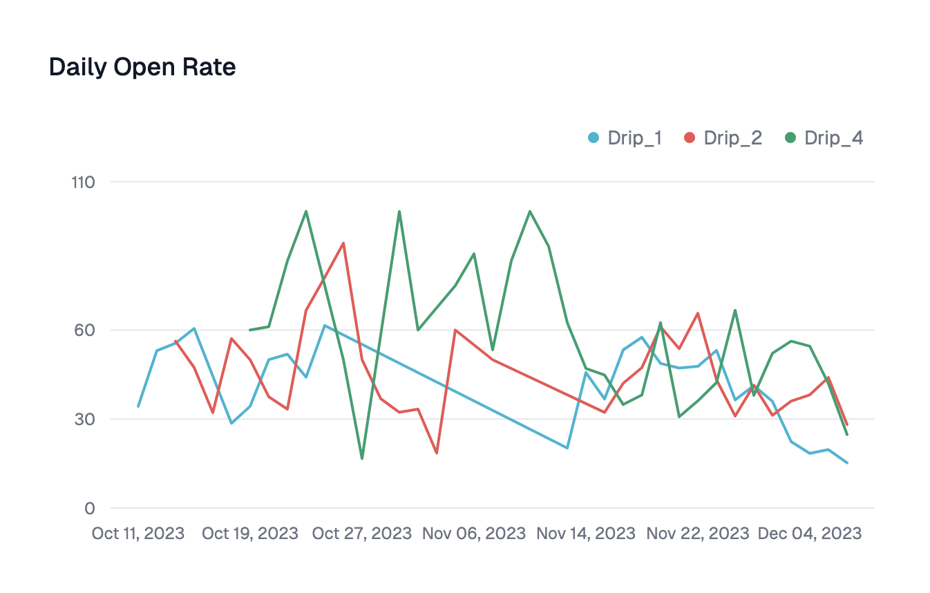
 ## Configuration
Category to group the chart by
Column to aggregate the line chart on. You could select multiple columns by **Add Series**
Divides series into meaningful subgroups. The data in each subgroups can then be aggregated via one of `Distinct count`, `Count`, `Sub`, `Average`, `Min`, `Max`
## Configuration
Category to group the chart by
Column to aggregate the line chart on. You could select multiple columns by **Add Series**
Divides series into meaningful subgroups. The data in each subgroups can then be aggregated via one of `Distinct count`, `Count`, `Sub`, `Average`, `Min`, `Max`