Connecting data:
We’ve already set up a sample database to help you quickly explore and test the platform without needing to connect your own data source. To view this connection, please go to the Connect tab as seen below: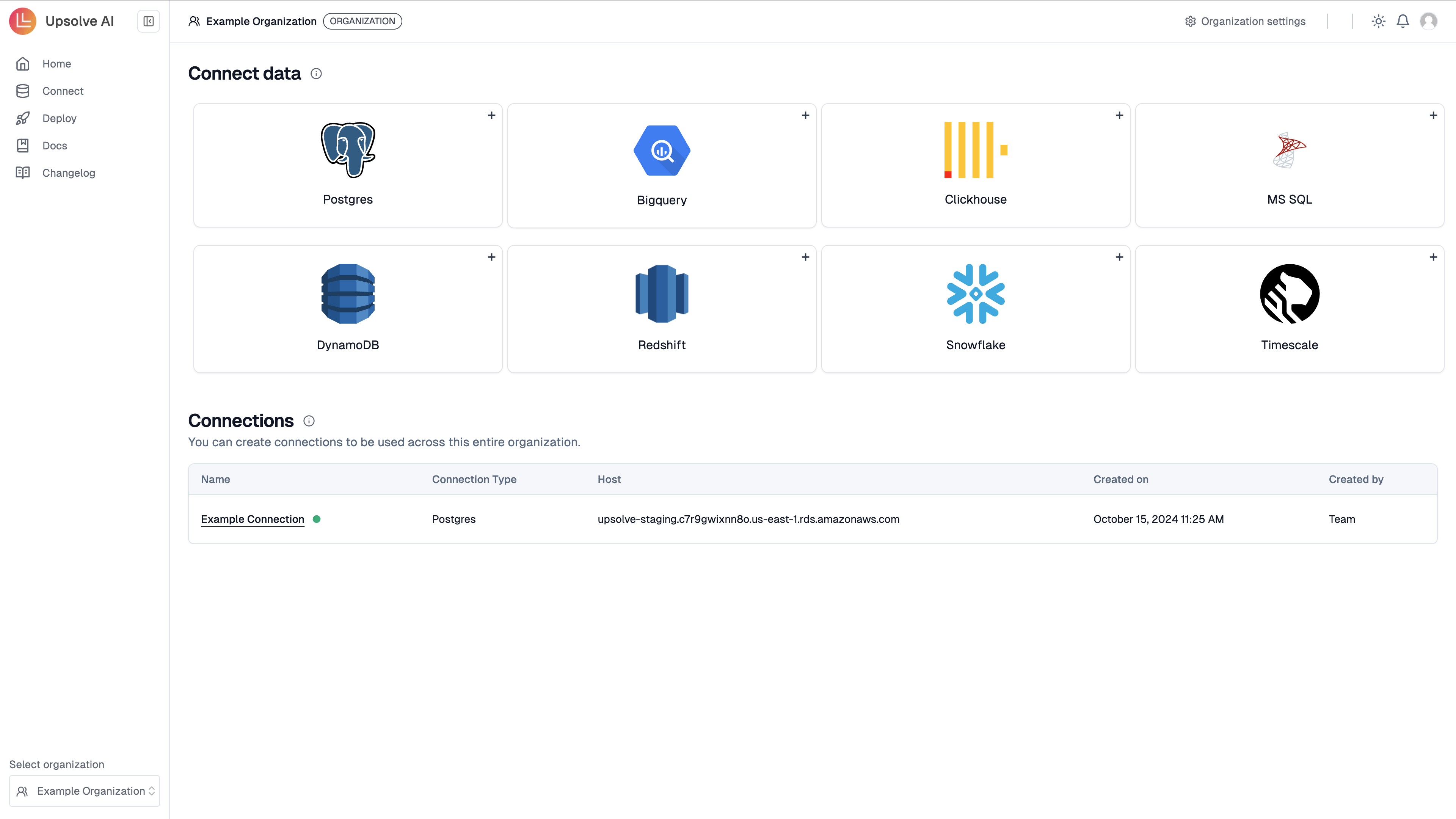
Build your first dashboard
In order to build your first dashboard you should begin by creating your first chart before adding to the dashboard.Build your first chart
It requires five steps to build your first chart. In the below example, you will build a grouped bar chart using the aggregations table.1. Select raw table(s)
1. Select raw table(s)
To begin click on + New Chart to open the interface.Search and select the table(s) that contain the relevant data for the chart you want to create, in this case, aggregations table.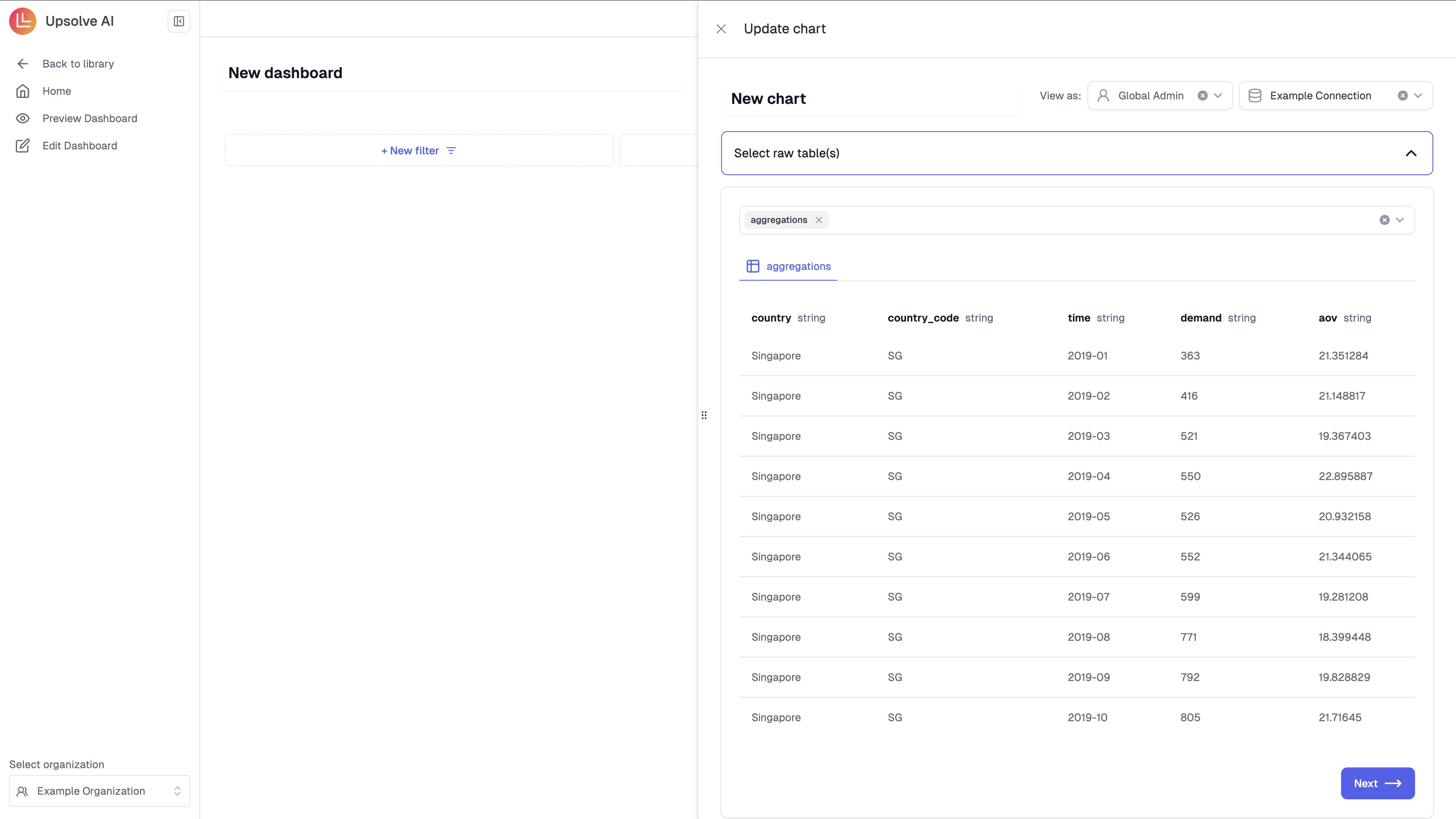
2. Prepare data
2. Prepare data
Write any SQL query to transform the table(s) you selected to a single table that you will consume in Step 3 for chart building. You could write SQL to join, filter on table(s) and more.For this example, you simply want to use the whole aggregations table for chart building. Click on the + aggregations, this will create
in the SQL editor.Click on Preview data to run the SQL and Next once you see the preview data.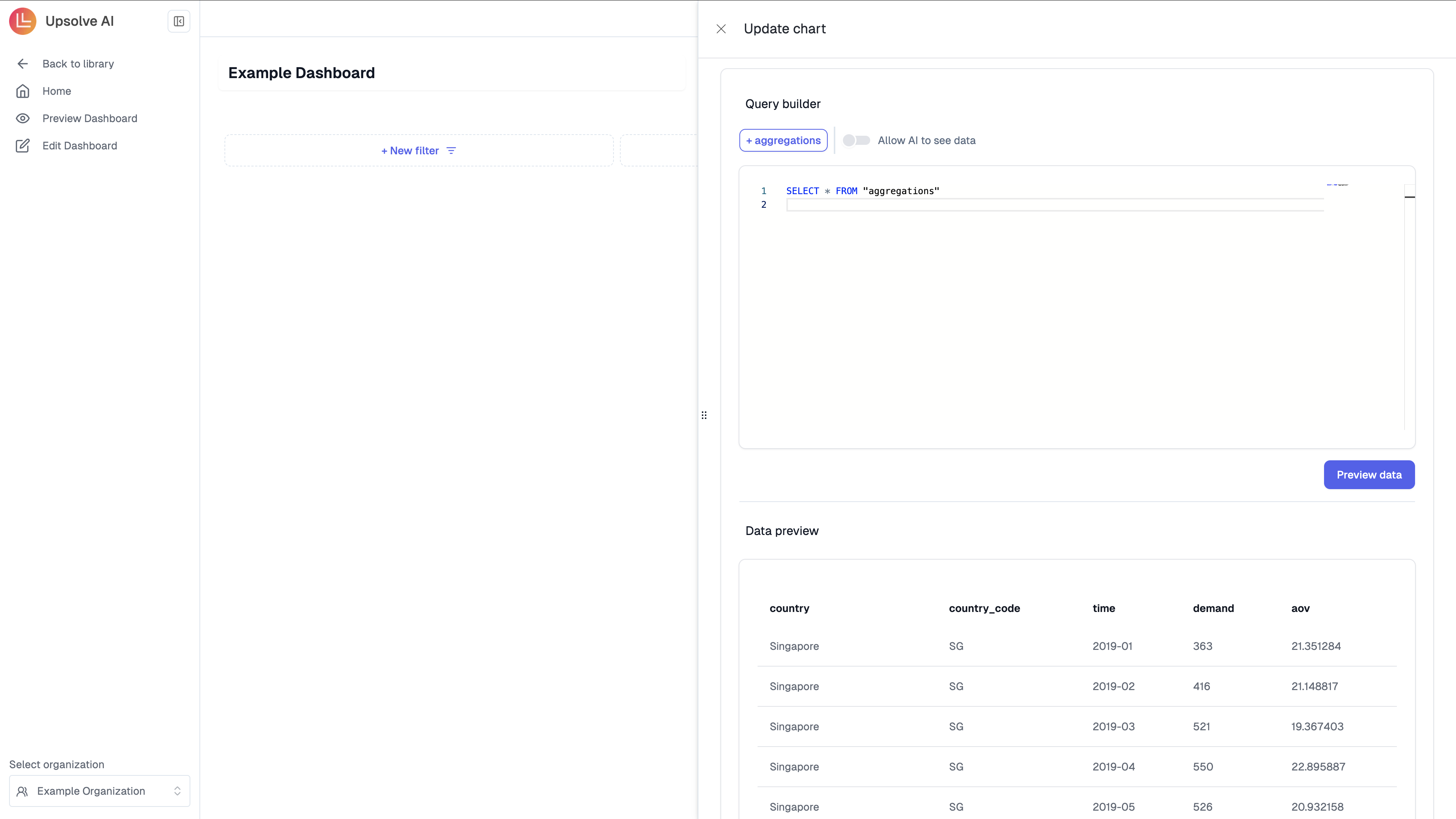
SQL SELECT * FROM "aggregations" in the SQL editor.Click on Preview data to run the SQL and Next once you see the preview data.
3. Build chart
3. Build chart
Select the relevant chart type, and choose the corresponding x- & y-axis columns for the charting. This chart will be consumed in step 4 when you create your Chart Filters.In this example, select a Grouped bar, and choose country as the x-axis and demand as the y-axis.
the corresponding x- & y-axisFor future charts see Chart Configuration for all chart settings.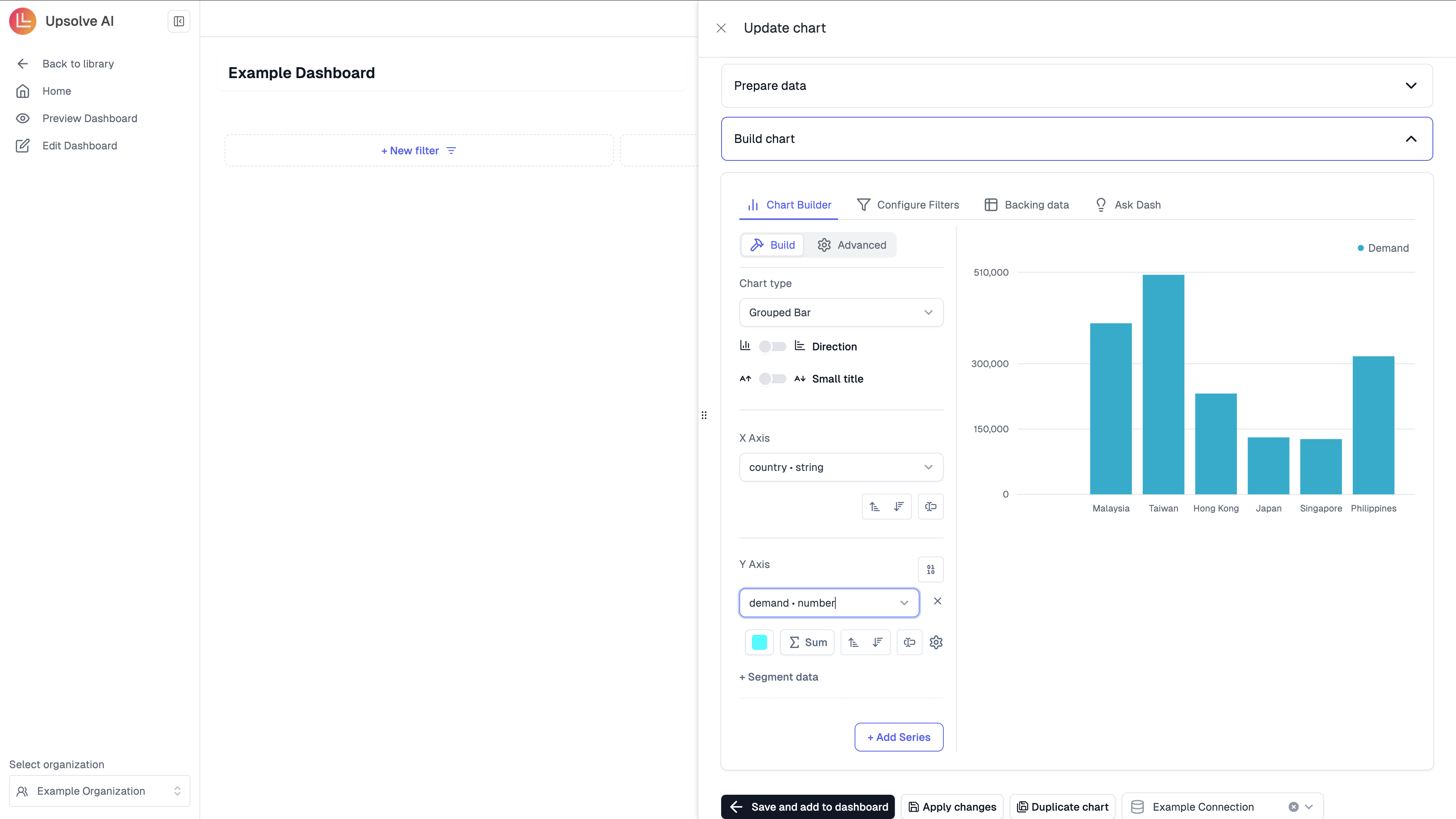
4. Add chart filters
4. Add chart filters
To add chart filters you will undertake two steps, firstly deciding the table to filter on and secondly configuring the filter. In this example, we will guide you through both of these steps.
Select Table
In this example we will select the Computed Table1. Selected backing tables: The list of selected backing tables in Step 1 is surfaced here. Filter any column in any selected backing table(s) that is powering this specific chart2. Table: filter any column from the table that was computed by the SQL written in Step 3.3. Variables in the chart SQL: inject variables into the SQL code that is backing this chart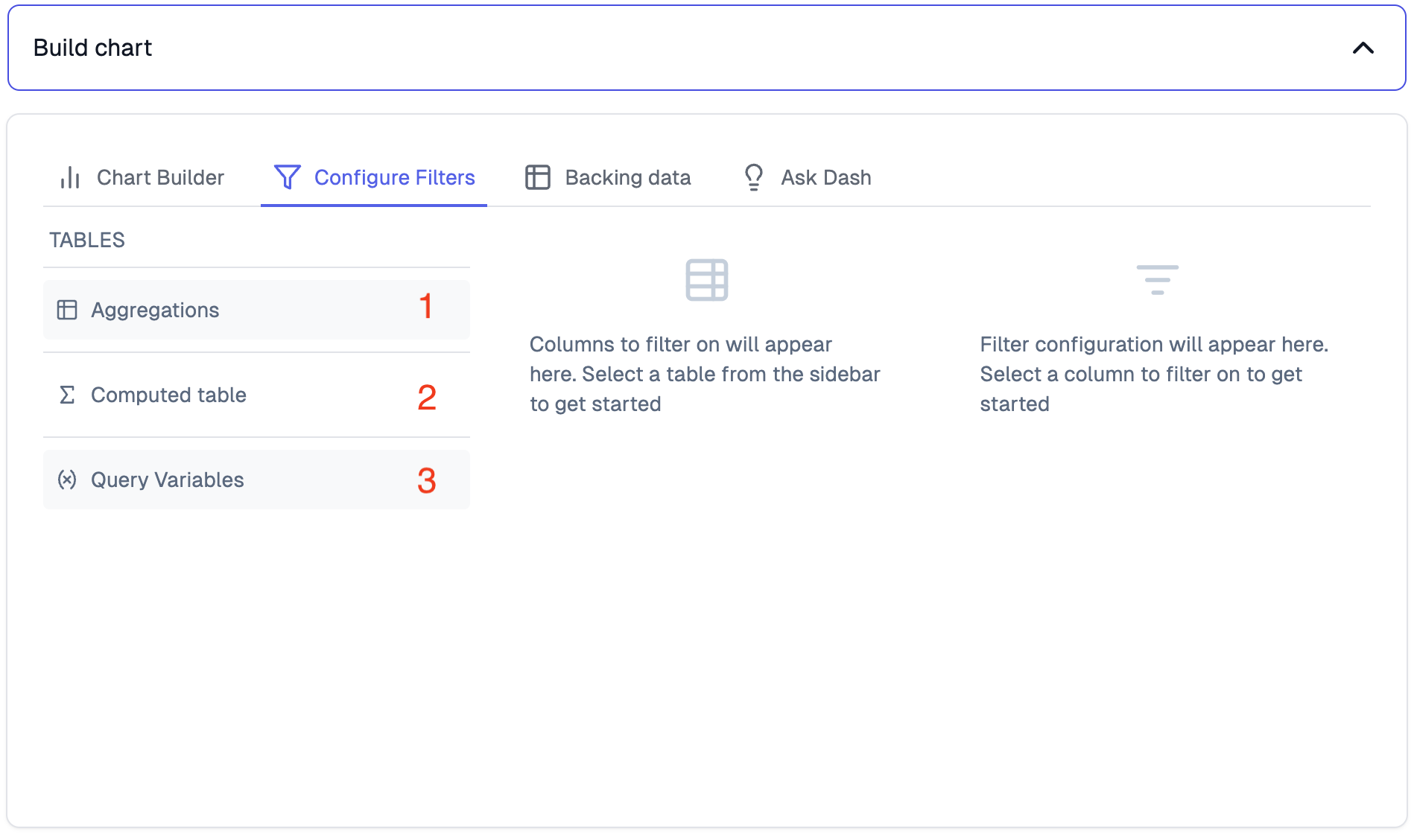
Configure Filter
1. Table: select the table to filter or “Query variables”, in this example select Computed Table2. Column: select the column or variable to filter on, in this example select Country3. Filter: configure the filter as needed. Options will be provided based on the type of filter selected. In this example chose Select and Select Multi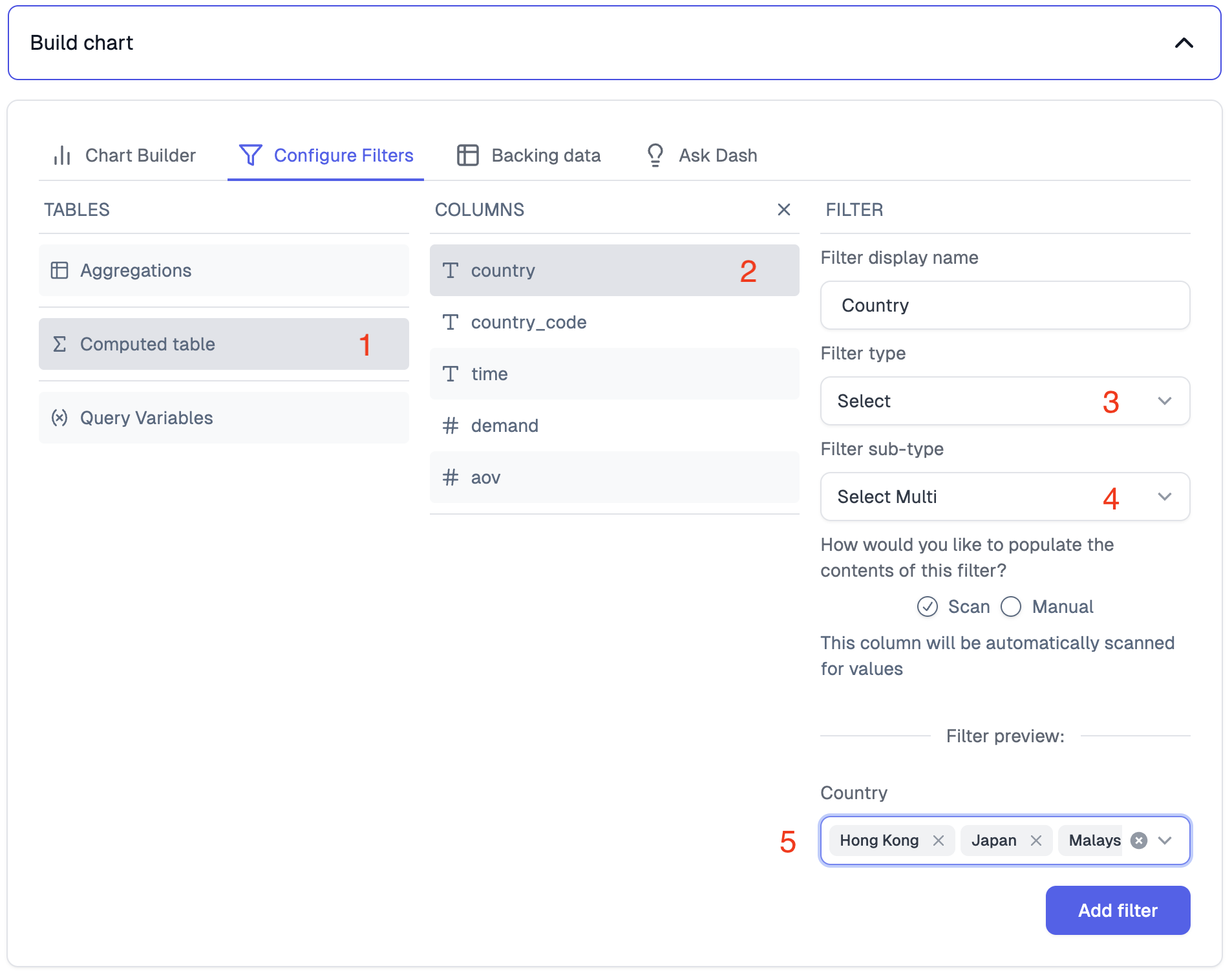
5. Save chart
5. Save chart
Click Save and add to dashboard when you are happy with your chart, this will save the chart. You could also
create a copy of the chart by clicking Duplicate.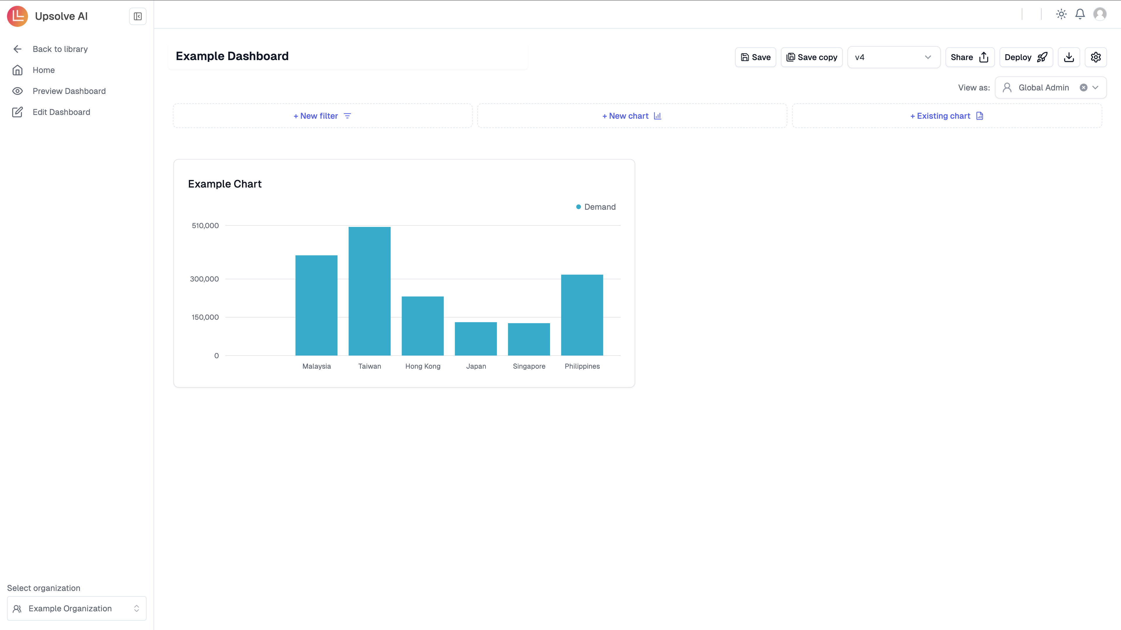
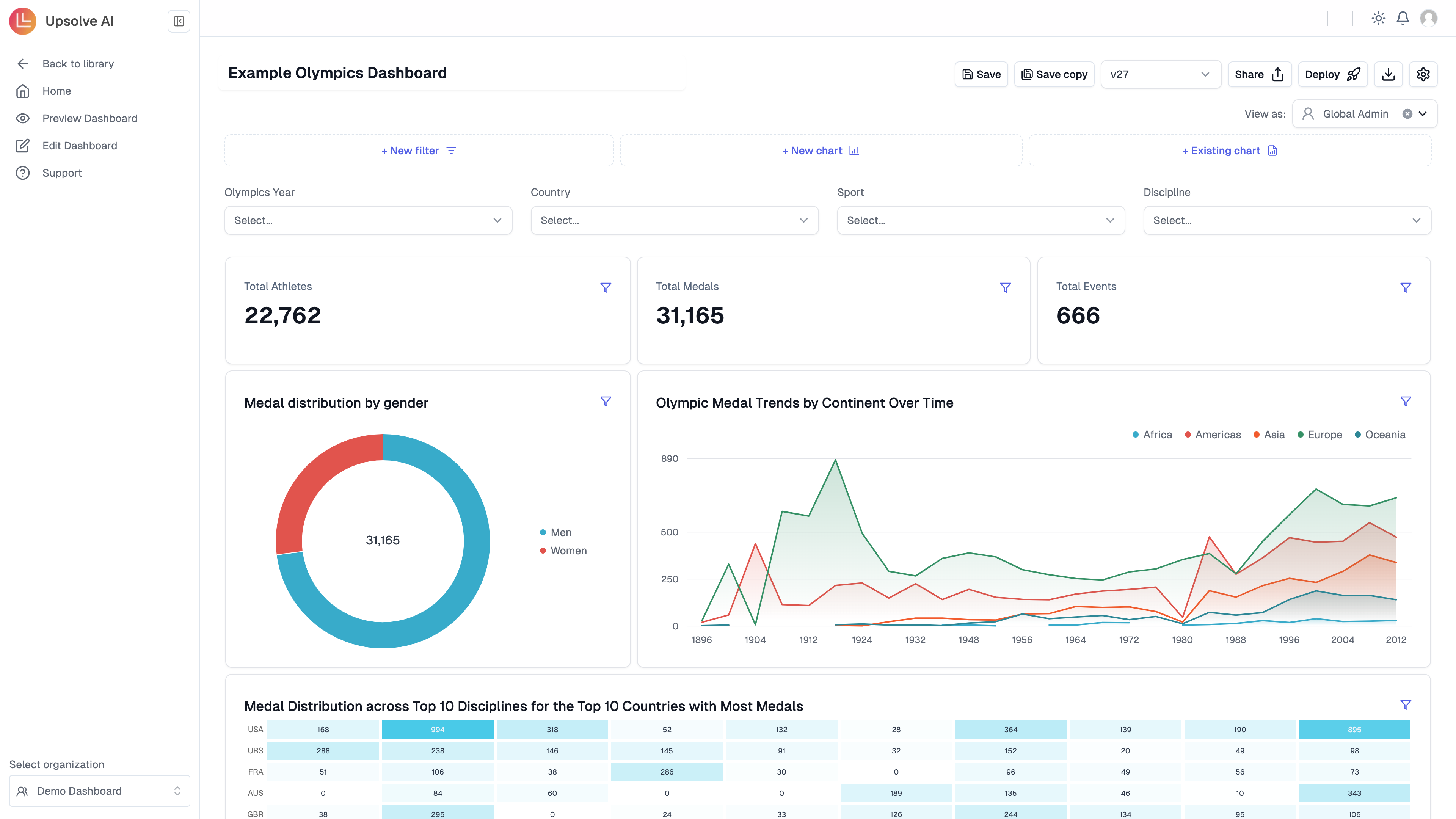
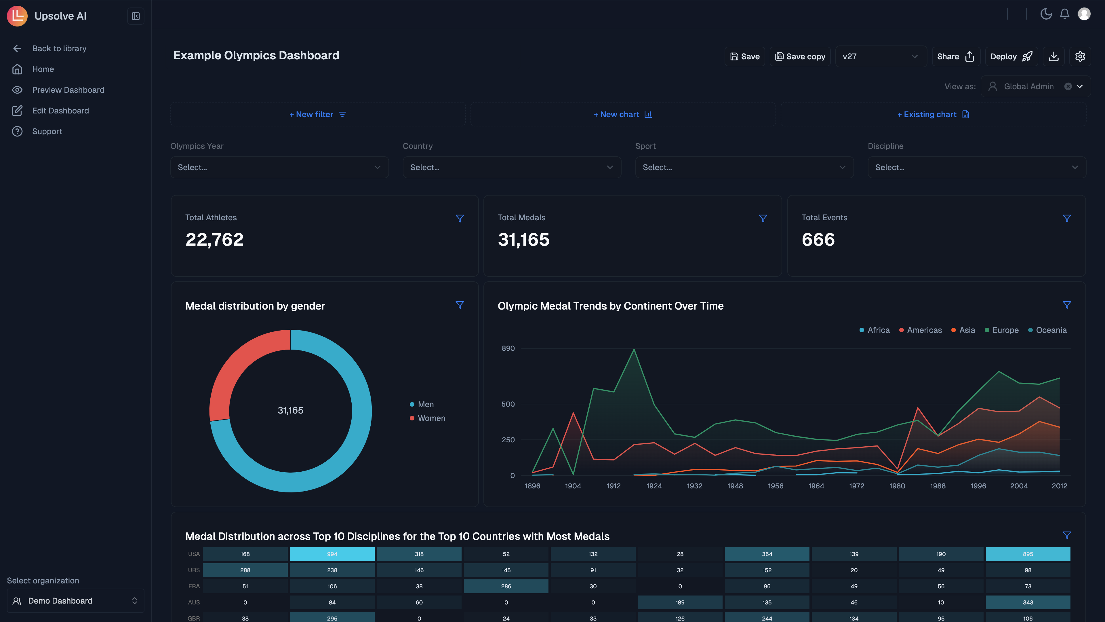
Configure your dashboard
You are able to customise your dashboard by adding dashboard filters, controlled filters and additional charts. To resize charts you can hover over the dashboard, and then simply drag the chart to the size you would like. To move a chart you can hover over the dashboard, and then simply drag and drop the chart.Add dashboard filters
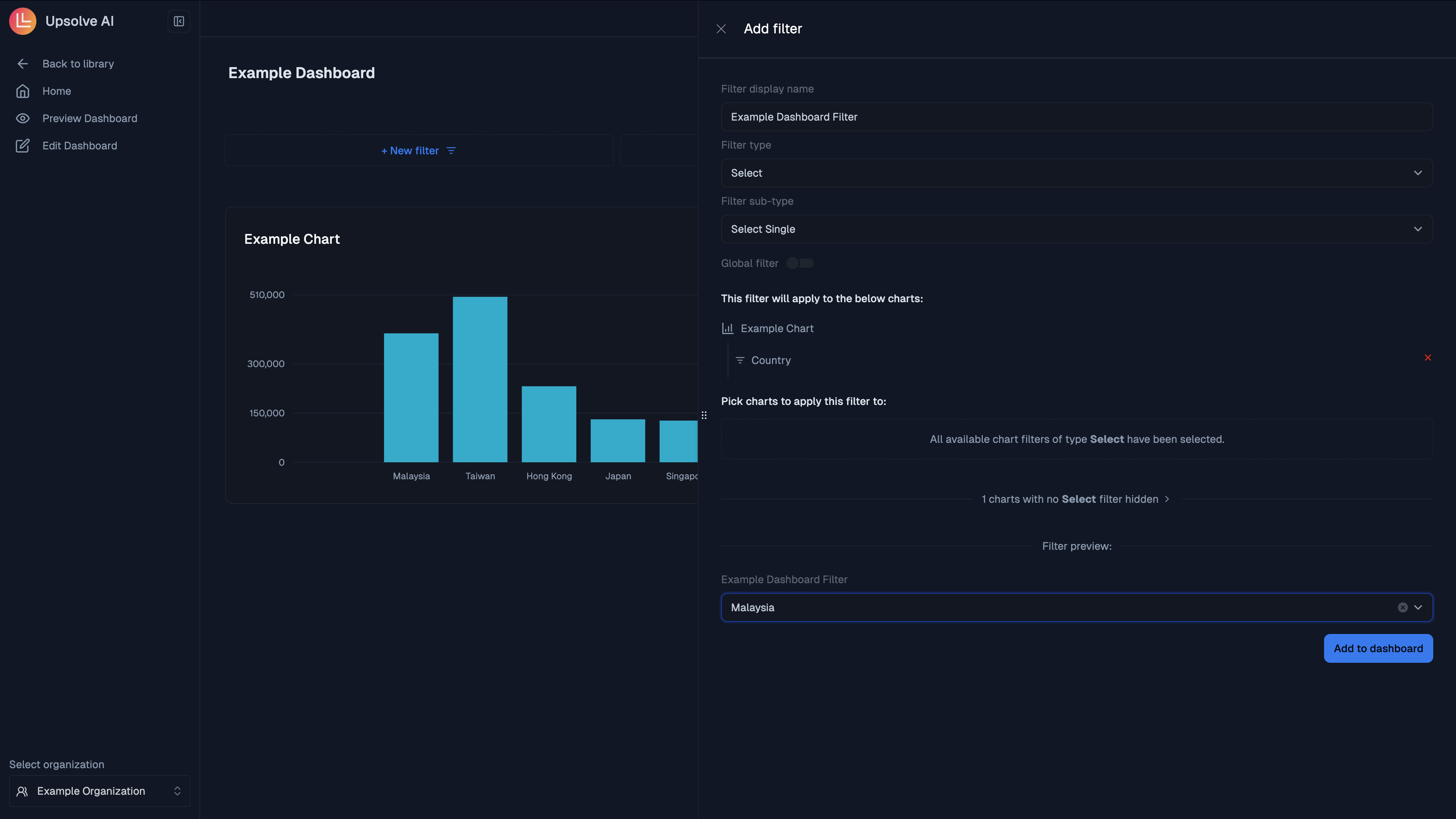
To add a dashboard filter please click on New Filter,1. Add Filter
1. Add Filter
Give your filter a name, and set the type and subtype. In this case, we are going to set a Select filter with single options allowed.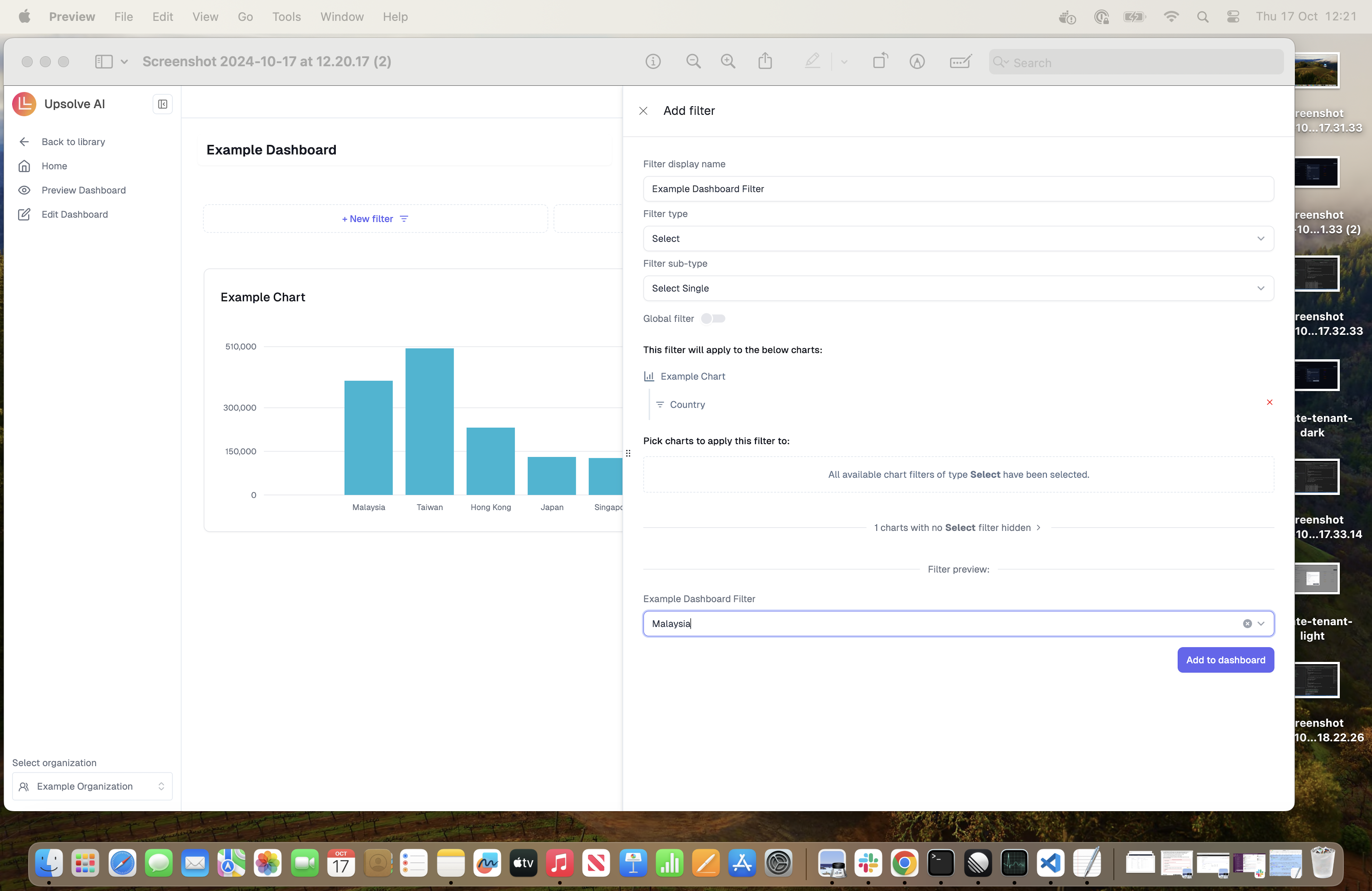
2. Select charts
2. Select charts
Select the charts you would like to pass a dashboard filter to. The available charts must have the same chart filter type as your dashboard filter type. Click the green (+) button next to each filter you want to target:In this example, the Example Chart has a Select Filter so we will use this chart.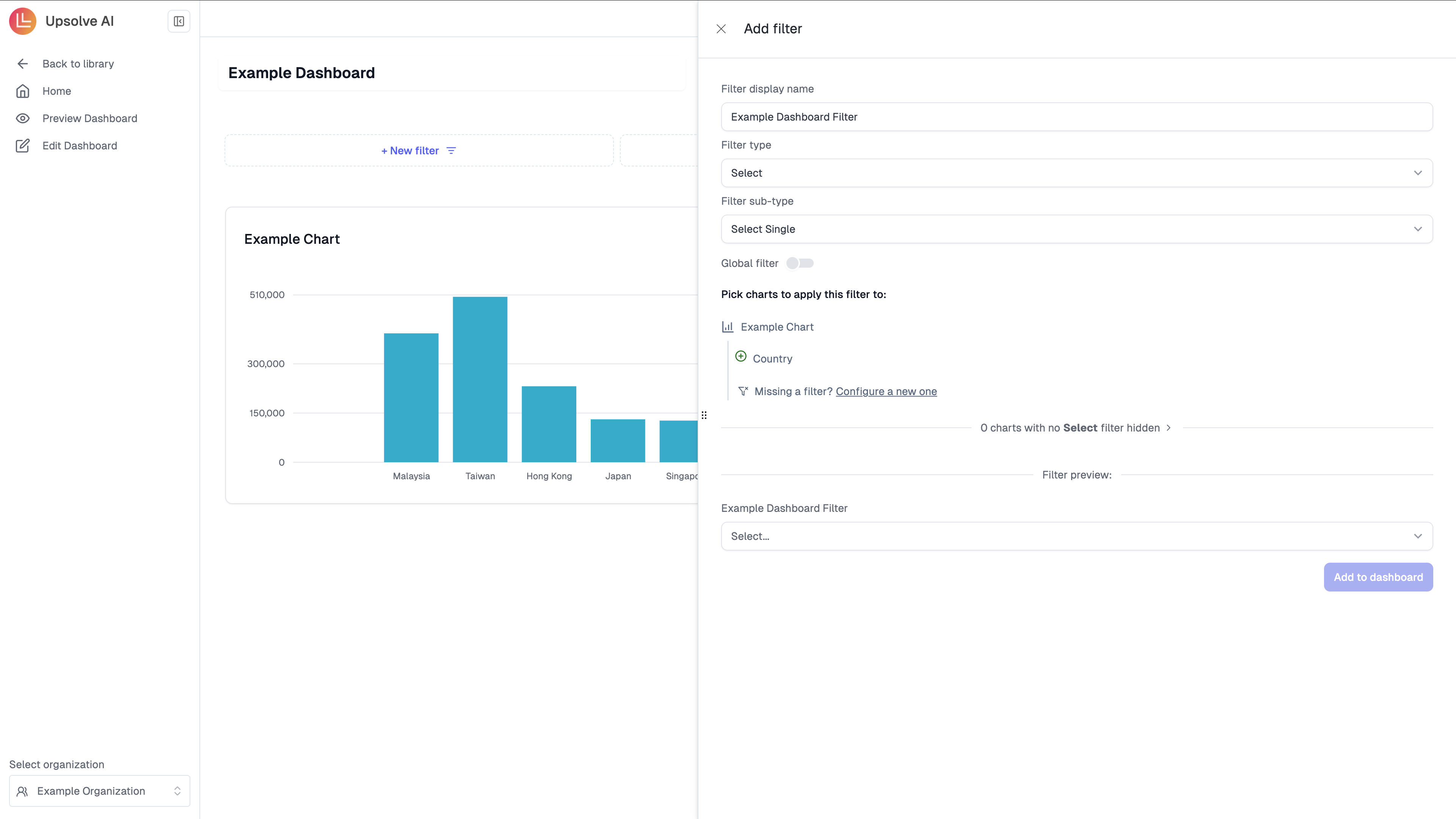
3. Filter Preview
3. Filter Preview
Once you have created your filter, you will be able to add the filter to the dashboard.You are able to test this by using example values, in this instance we will use Malaysia.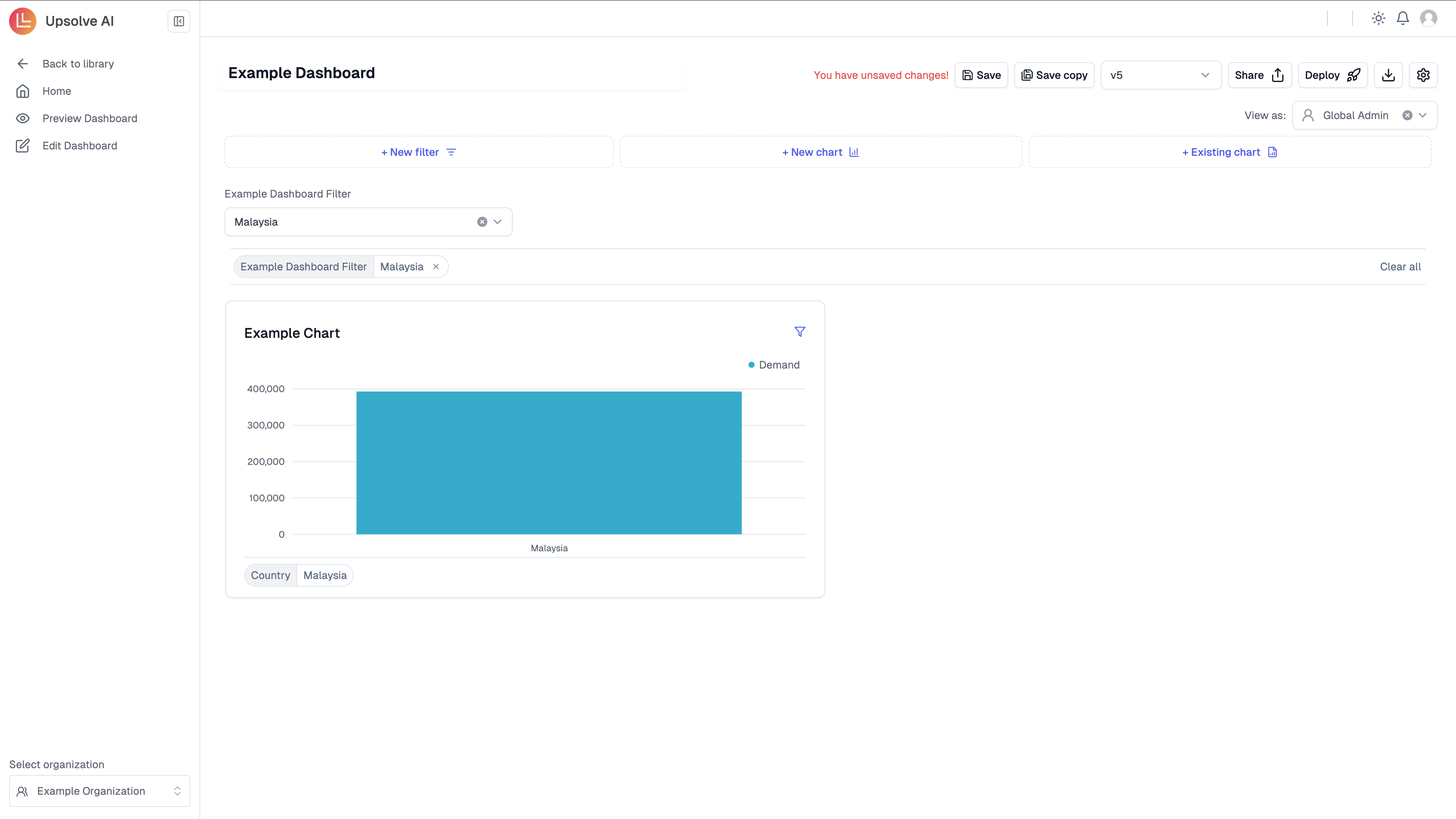
Add charts
To add additional charts you can go to through the steps of creating a new chart. Alternatively if you have already built a chart you can click on Add Chart to use on your dashboard.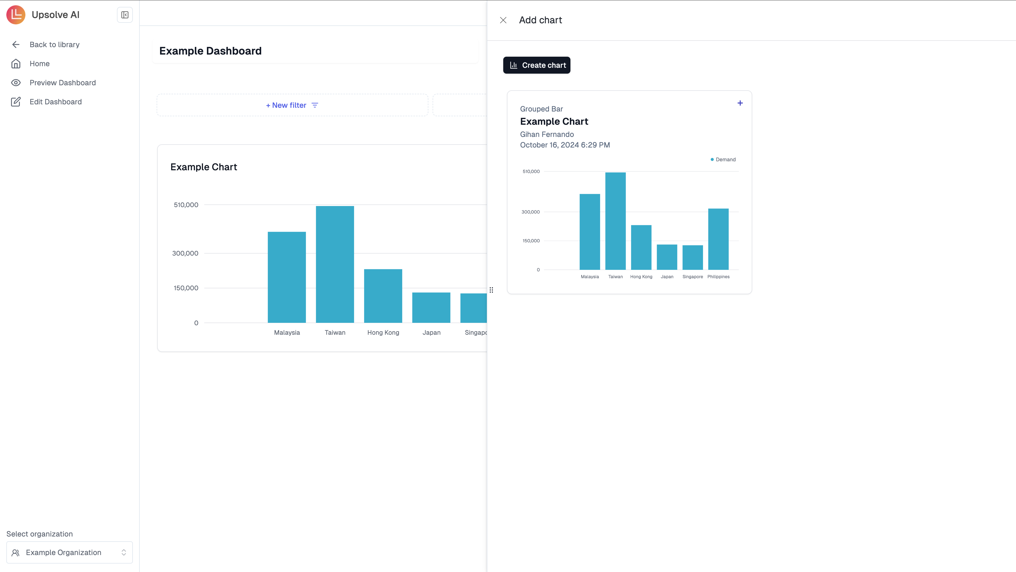
Share your dashboard and collaborate
You can share your dashboard via email with anyone by clicking on the share button and sharing it, if you would like a preview of the dashboard please click on the preview. By sharing your dashboard, they will become a team member of your organization and can view, edit and collaborate on the dashboard(s) with you.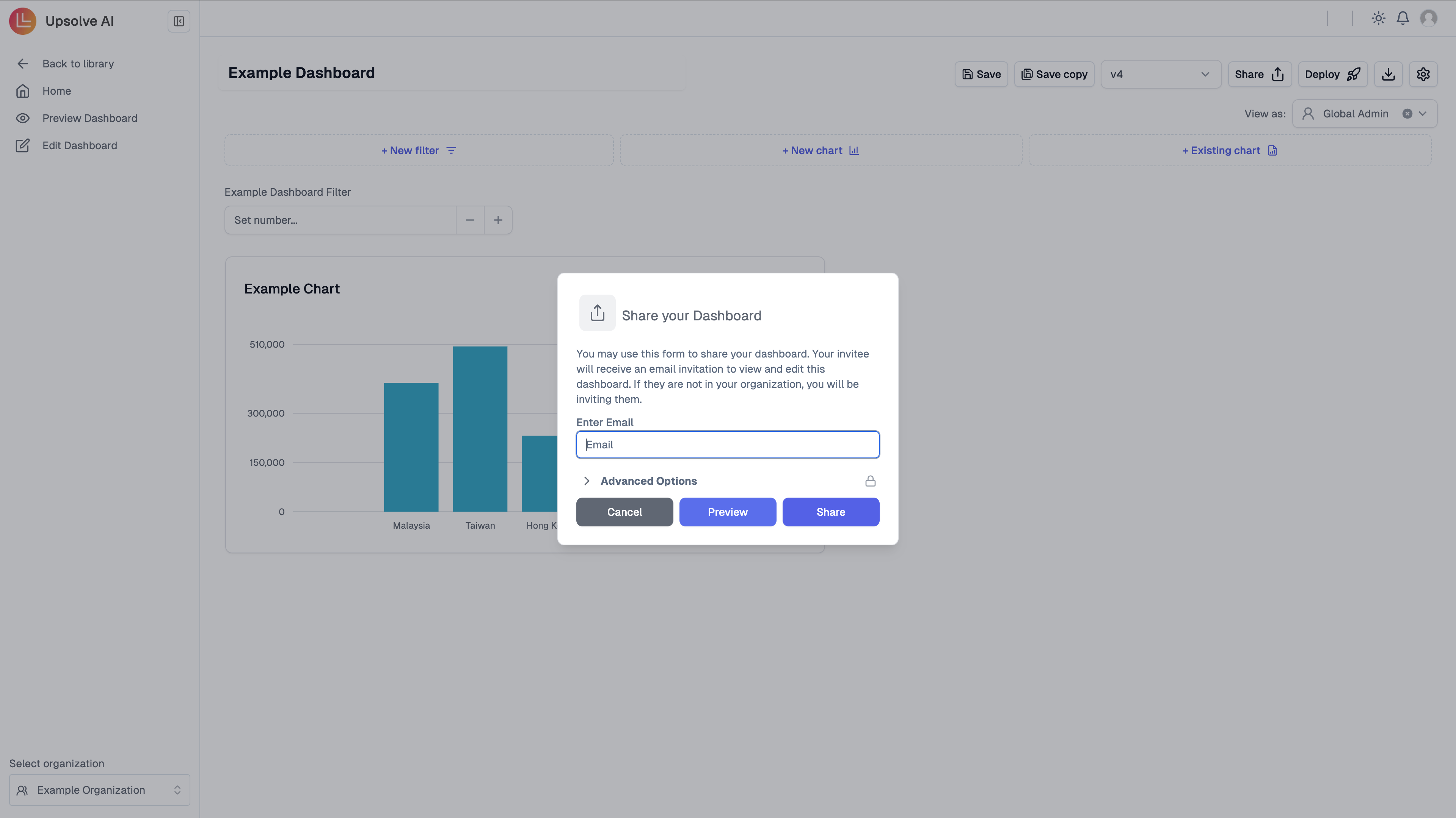
If the invitee aceepts the invite, they will gain access to ALL dashboards and
data in your organization!
User Authorization (Tenant Registration)
To set up tenant registration please follow the steps outlined in Backend Setup. Alternatively if you are using our sample database and do not intend to go live with the dashboard this step is optional.Preview dashboard as your designated end users
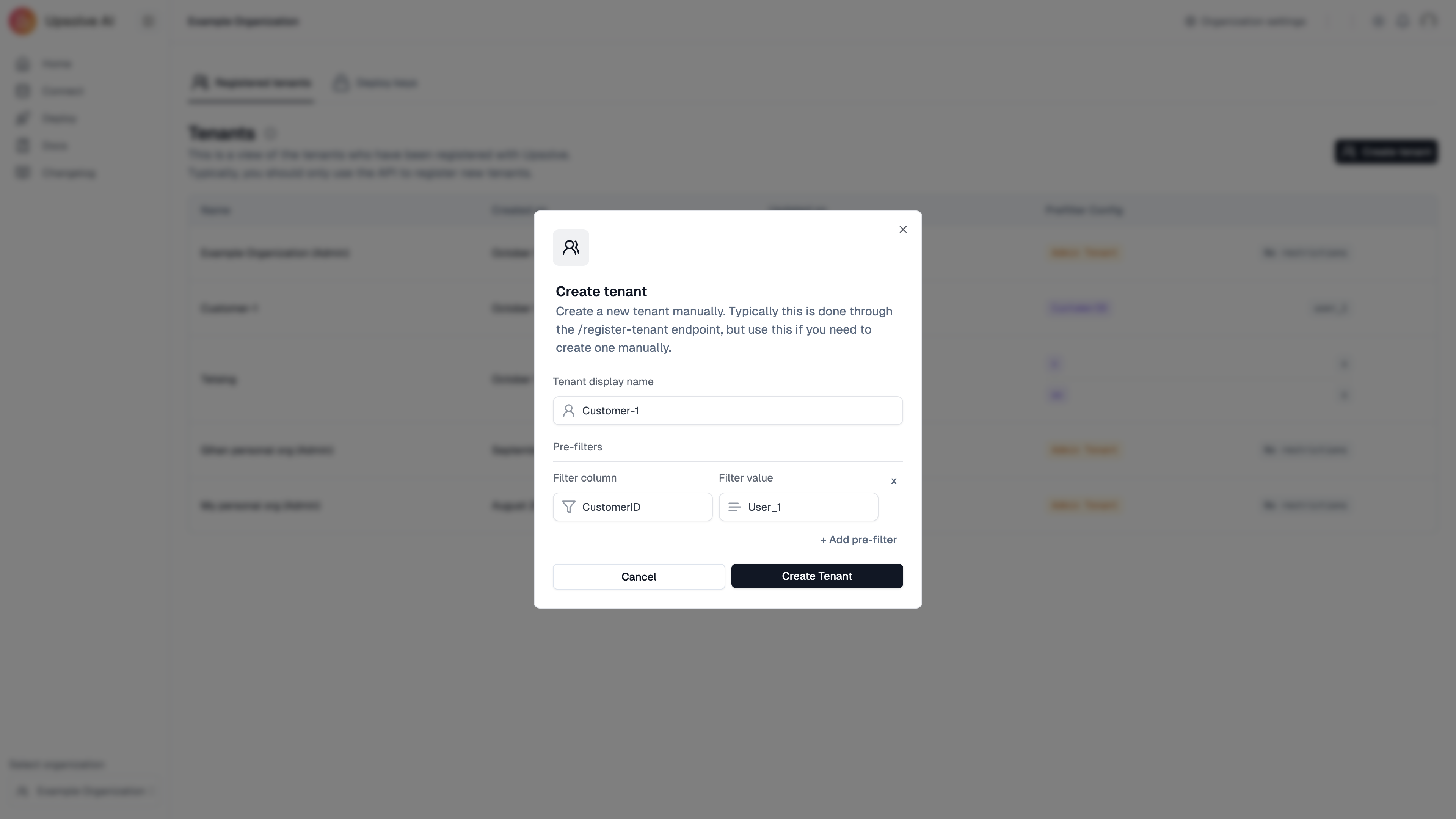
If you have completed the Backend Setup, you are able to view the dashboard as one of your customers. Please click on the View As button in your hub. If you do not intend to go live with the dashboard, and thus did not setup your backend accordingly, you could use the platform to create a testing tenant instead and preview the dashboard as the testing tenant. We have provided two sample testing tenants for you for the sample database, which you could use to preview the example dashboard built as the tenant.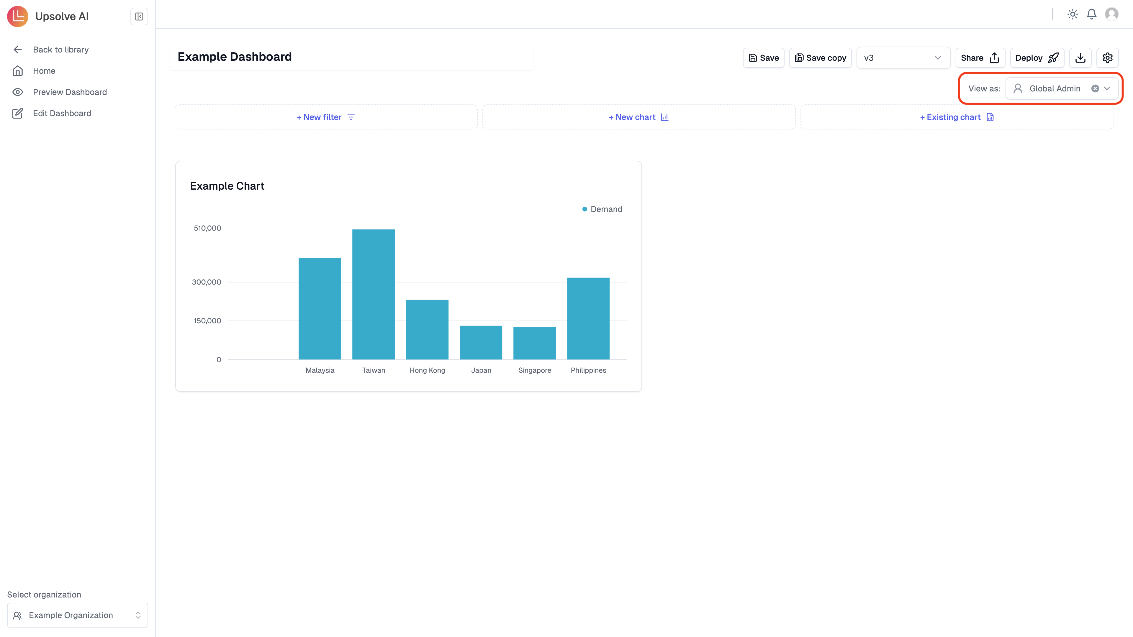
- Tenant Display Name:
{customer-1} - Filter Column:
{CustomerID} - Filter Value:
{User_1}
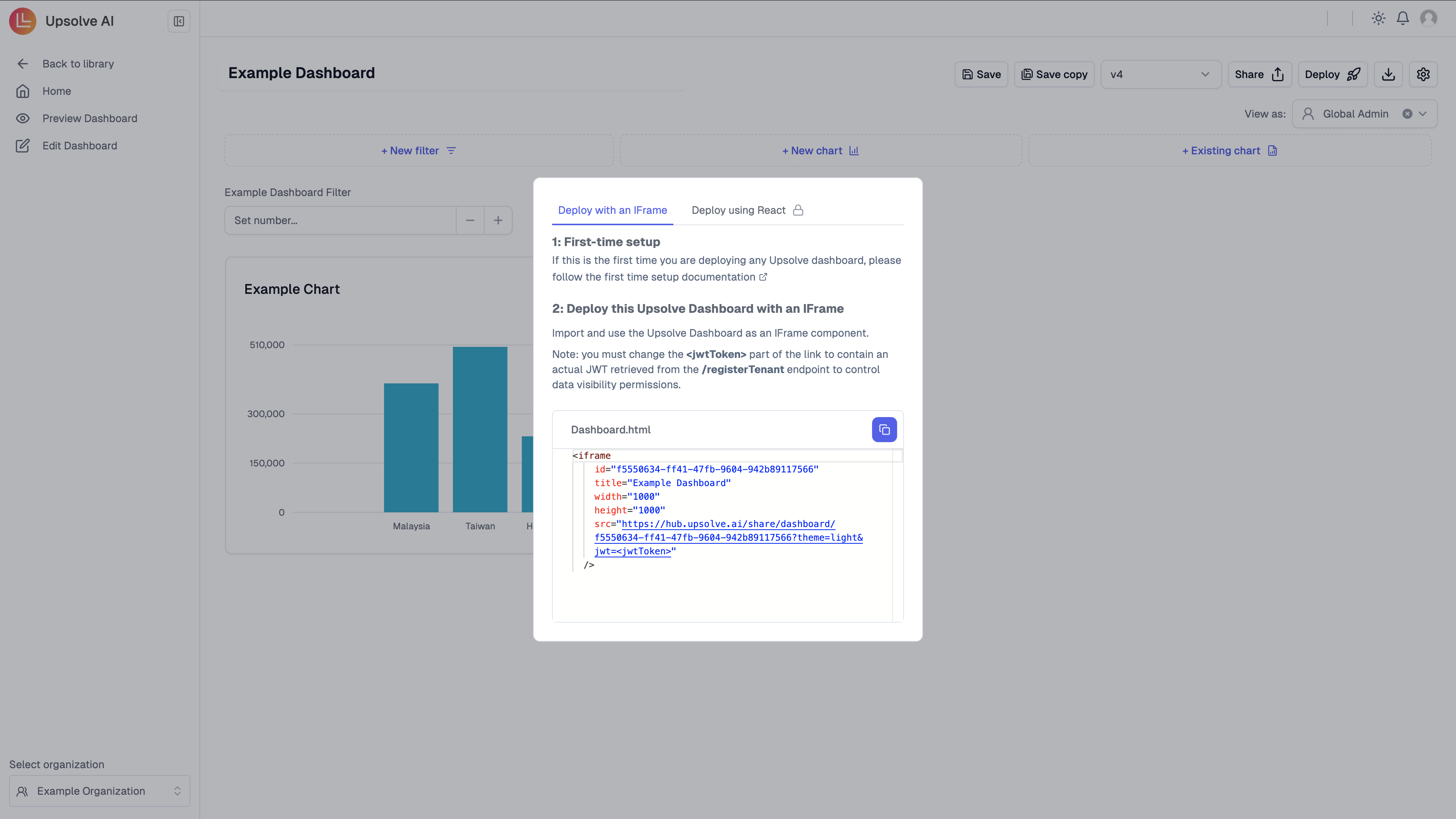
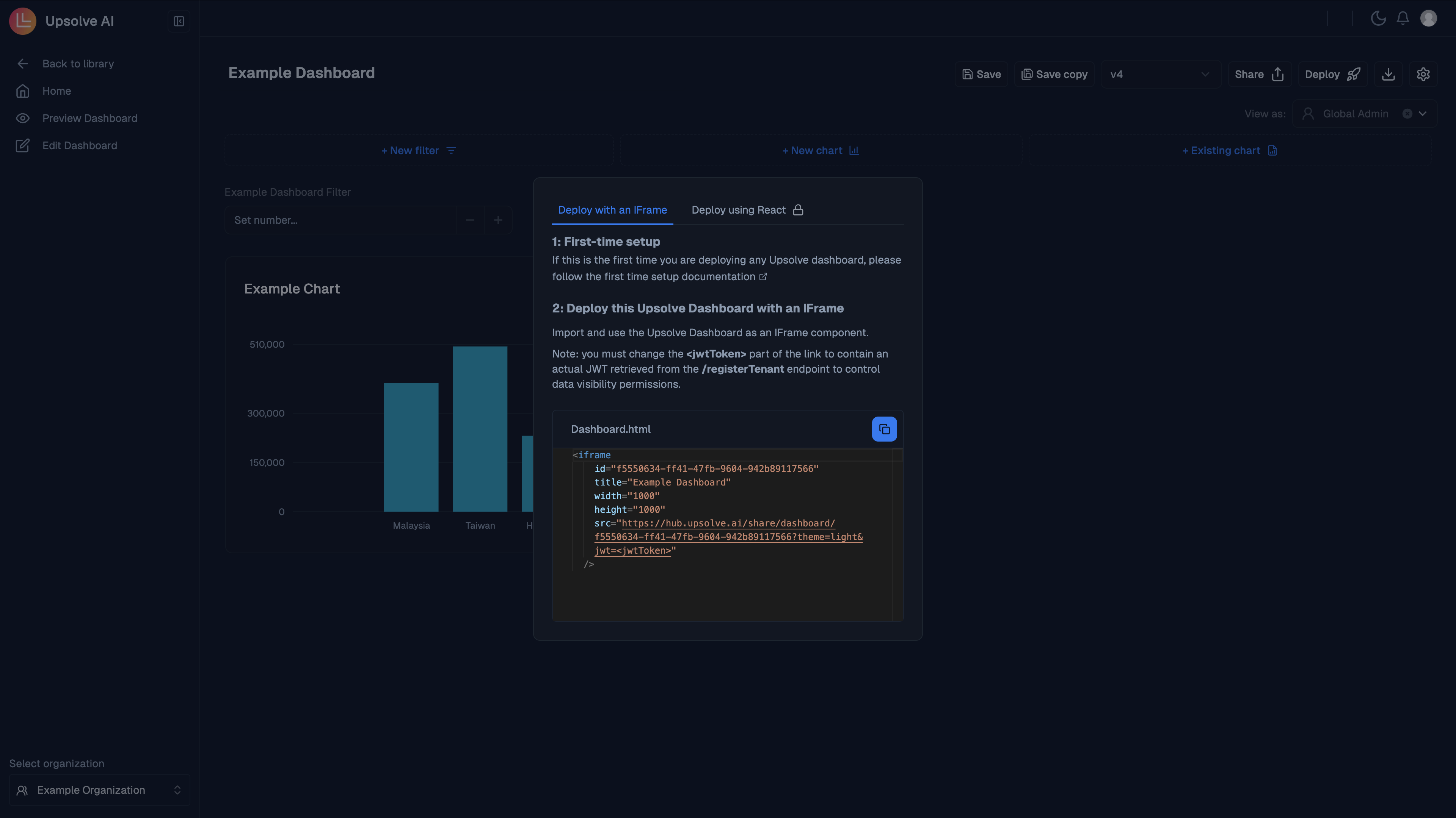
Deploy your dashboard
Please click on the Deploy button in the Hub.