
Overview
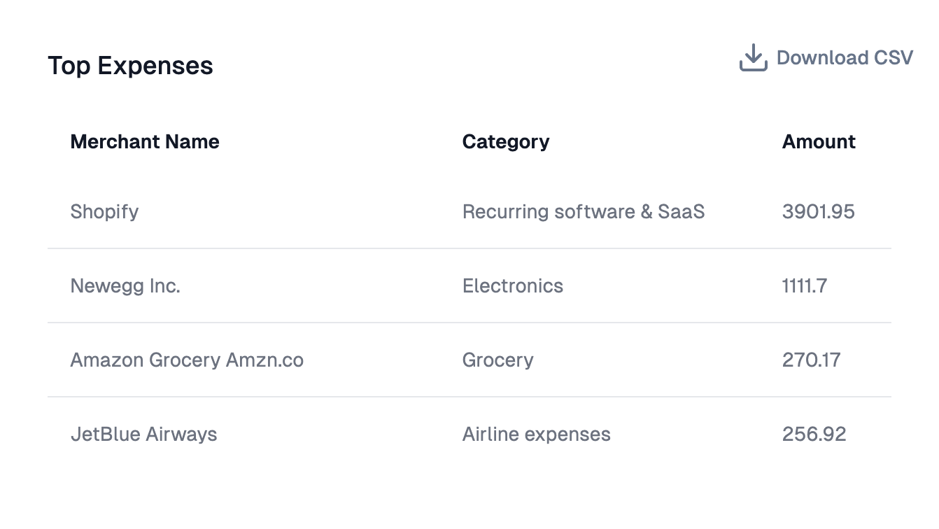
The Table component provides enterprise-grade functionality for displaying tabular data with extensive customization options including filtering, sorting, column management, and advanced formatting.Core Features
- Interactive Controls: Filtering, sorting, resizing, and reordering columns
- Responsive Design: Adapts to different screen sizes with theme support
- Data Management: Pagination, column hiding, and pinning
- Real-time Updates: Dynamic data refresh capabilities
Configuration Options
Display informational text about your chart with hover tooltips in table headers.
Allow users to filter data within columns. Filter controls appear in column headers for searching, selecting values, or applying range filters.
Enable table sorting functionality. Users can click column headers to sort data ascending or descending. Hold Shift for multiple column sorting.
Allow users to resize columns by dragging column borders to adjust widths based on content and preferences.
Save custom column widths that persist across sessions. User adjustments are remembered and restored when the table reloads.
Enable pagination for large datasets with configurable rows per page and navigation controls.
Column Management
Hide Columns
Hide specific columns from view to focus on important data or remove sensitive information while maintaining the underlying data structure.
Pin Columns to the Left
Pin columns to keep them visible while scrolling through wide tables. Essential for keeping key identifiers (names, IDs) visible.
Column Formatting
Number Formatting
- Format Locale: Set locale for number formatting (e.g., ‘en-US’, ‘de-DE’)
- Format Options: JSON configuration for Intl.NumberFormat() options
- Format Prefix/Suffix: Add text before/after numbers (e.g., ’$’, ’%‘)
Conditional Formatting
- Condition: JavaScript expression to evaluate against values
- Style: Text styling (bold, italic, etc.)
- Color: Text and background colors for matching values
Hyperlink Configuration
- Base URL: The base URL for the hyperlink
- Parameter Name: Query parameter name for the cell value (defaults to ‘q’)
- Value Source: Select the value from the current column or reference another column
- Open in New Tab: Whether to open links in a new tab (defaults to true)
- Display Text: Override text to display instead of the cell value
Advanced Features
Column Customization
- Custom Column Names: Override default column names with user-friendly labels
- Column Info Tooltips: Add informational tooltips to specific column headers
- State Management: Persist sorting, width, and order preferences
Data Export
- CSV Download: Enable CSV export functionality
- Download Title Prefix: Customize the filename prefix for downloaded files
Styling Options
- Theme Integration: Customize background colors, font families, and CSS classes
- Visual Customization: Row striping, header styling, and cell styling